


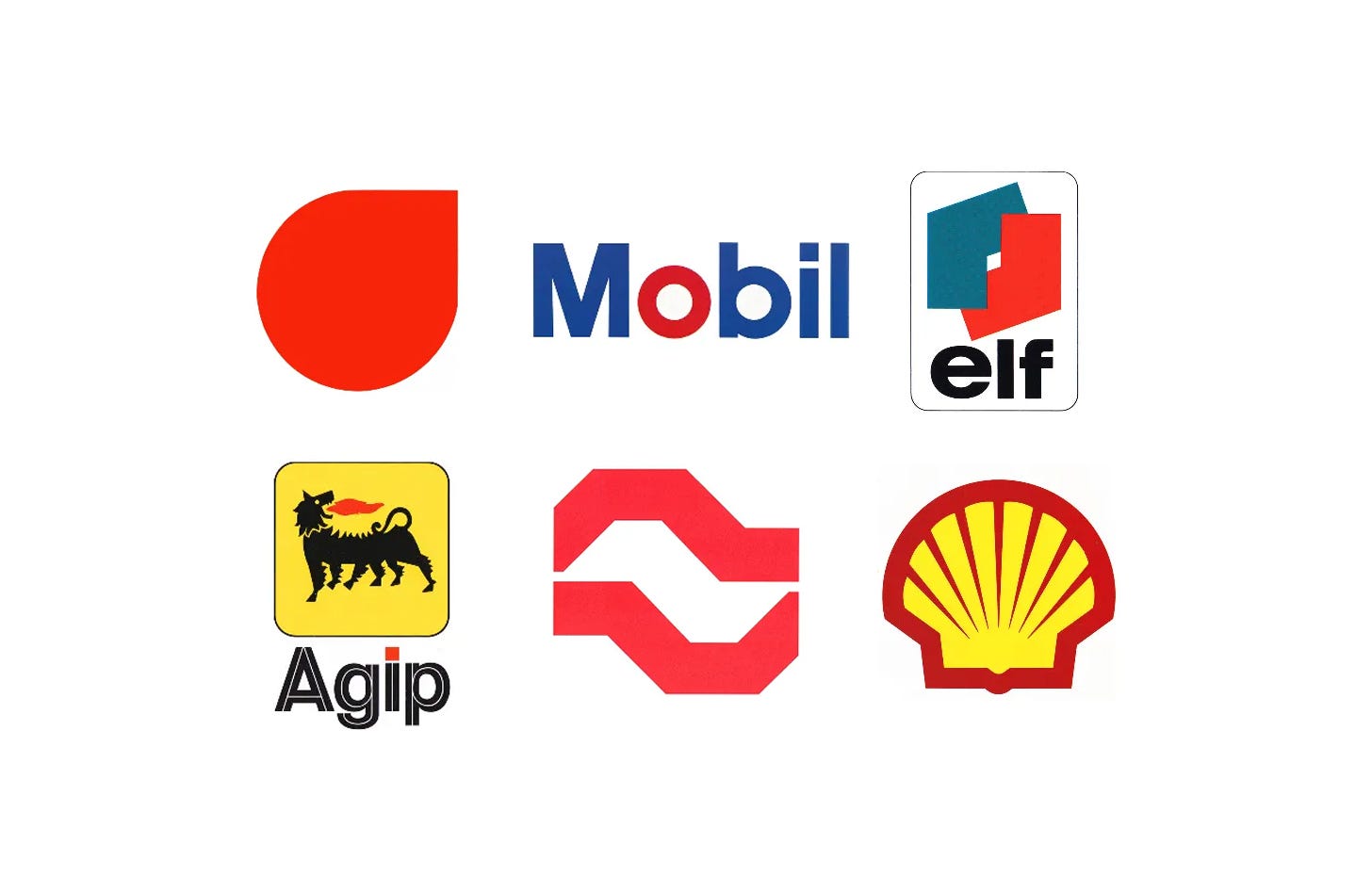
Petrol stations were among the most visible pieces of corporate identity of the post-war years. As car ownership boomed and self-service spread across Europe, oil companies needed logos that could be read at a glance from a moving car, and applied consistently to signs, pumps, canopies and tankers.
Here are seven oil company logos and corporate identities, from Benno Wissing’s red drop for PAM in 1965 to Alexandre Wollner’s 1986 logo for São Paulo Petróleo.
Key Takeaways
Built for the forecourt
Self-service stations and roadside signs demanded marks that read instantly; Mobil even tested its new logotype on signs set up in open fields.
One short name
Mobil cut its identity down to a single wordmark, and Elf brought the ERAP Group’s many station names together under one short name and logo.
Evolve, don’t erase
Shell’s scallop evolved over sixty years before Loewy’s simpler pecten, and Mobil kept its Flying Red Horse as a separate graphic element rather than discard it.
Go behind the logos. Explore 200+ in-depth and meticulously researched logo histories revealing the designers, design decisions and ideas behind the world’s most iconic logos and important brand identities.
Continue reading to discover how seven oil companies turned drops, shells, dogs and wordmarks into identities built for the forecourt →

PAM, 1965
Benno Wissing, Total Design
The newly established Total Design was hired to develop a visual identity to coincide with and support the name change. Under the direction of partner Benno Wissing, a red right-angled triangle was conceived. This was based on an element from the coat of arms of Utrecht symbolising the coat Saint Martin, the city’s patron, cut in half to share with the poor. This abstract logo would later be developed into a second logo for SHV’s heating company Warmtecentrum, which featured the triangle in a 2x2 arrangement.
Benno Wissing and his team, which included George Koizumi, Pieter van Delft and later Hartmut Rowauke, developed a new modernist logo for PAM that was in line with the latest ideas shaping corporate identity design at the time.

Mobil, 1966
Chermayeff & Geismar
The idea of getting down to the word 'Mobil,' rather than 'Mobil' plus the horse symbol, was central. There was great equity in the Flying Red Horse, having been established over many years. C&G didn't want to take it away, rather, redefine its usefulness as an independent graphic element.
Alongside improvements to the drawing of the horse, the studio developed a new simplified 'Mobil' sans-serif logotype, derived from Helvetica and Futura, and freed this from the horse, improving the immediacy of the new shorter name. This would then be developed into a corporate typeface that could be used to unify a vast array of products, solving a key issue of inconsistency. The blue and red first introduced by Peter Schladermundt Inc. were brought together with the speculation being that the red 'o' would help a global audience pronounce 'Mobil' correctly, placing emphasis on the right syllable.

Elf, 1967
Jean-Marie Chourgnoz, Henry Chaney, Erich Brenzinger & Jean-Roger Rioux
By the early 1960s the ERAP Group appeared in France under several names. Among them were Caltex, CFPP, Lacq, La Mure and Avia. These covered refineries and chemistry, the production of oil and gas, and an international distribution network that extended across six countries. The formation of UGD (General Union of Distribution) in the mid 1960s was an initiative to essentially ‘re-group’ these. The combined efforts of each would then be focused, operating under a common logo and new name, vastly increasing the visibility of the total enterprise.
What would become the Elf corporate identity is a story of two parts; the Elf name, logotype and logo and the ‘Red Spot’. The design of these would fall under the jurisdiction of two separate design groups, the first; made up of Jean-Marie Chourgnoz, Henry Chaney and Erich Brenzinger, would devise the concept and the drawing of the logo and logotype, and later Jean-Roger Rioux who would work on the standardisation of the corporate identity (CI) and be responsible for the introduction of a further graphic element, a red spot.

BP, 1968
Crosby/Fletcher/Forbes & Adrian Frutiger
In 1958, the Paris-based design firm C.E.I. led by Raymond Loewy, was commissioned by BP to examine their visual language. Research indicated that the logo had a high visual equity so, rather than redesign the logo, it was refined and a new modernised house style was introduced.
The introduction of self-service petrol stations throughout Europe in the 1960s had proceeded faster than in the United Kingdom and, in particular, Sweden, Germany and Denmark. To reinforce BP’s market image as it grew, Crosby/Fletcher/Forbes were given the task in 1968 to develop its UK self-service stations and packaging.

AGIP, 1971
Bob Noorda, Unimark International
Buoyed by this success, AGIP embarked on the development of a new corporate identity. This intended to better reflect the quality of its service, help with its expansion into products beyond fuel, present itself as a major Italian business with a ‘strong social and cultural sensibility’ and support its mission to ‘provide a wide range of services’.
The Milan office of Unimark International, headed by Dutch-born designer Bob Noorda, was commissioned to review and develop a new image for the corporation. This would be vast in scope, encompassing design for service stations, fuel pumps, packaging, signage, stationery, uniforms and the interiors of motel restaurants.

Shell, 1971
Raymond Loewy
Shell’s first logo was a mussel, replaced after four years by a scallop that evolved incrementally over 60 years.
Raymond Loewy’s simpler, stronger pecten and extended logotype were developed between 1964 and 1970 and rolled out in 1971.

São Paulo Petróleo, 1986
Alexandre Wollner
In order to better compete with these brands Companhia São Paulo Distribuidora de Derivados de Petróleo, later become São Paulo Petróleo, sought to consolidate and formalise its image. In 1986 renowned Brazilian designer Alexandre Wollner was given this task.
The objectives included making the corporation’s identity more flexible and adaptive to technological and cultural development; to convey a more defined ‘national character’; improve overall communications; reflect the corporation’s quality standards; and make its image more ‘compatible’ with the international markets.
Read the full São Paulo Petróleo story →
Read next
For more logos made for the road, browse every oil company logo history in the archive, or see more of the best in the Top 10 logos of all time. Become a paid subscriber to read every story in full, richly illustrated.
Want more in-depth articles? Check out LogoHistories’ other articles on oil and energy logos →


Thank you for subscribing to Logo Histories. If you enjoy reading this short you may also enjoy these resources from the same team:
Brand Archive – Research tool for brand designers.
LogoArchive Website – Searchable modernist logo archive & research tool.
LogoArchive Shop – Vintage design books & LogoArchive Zines.
BP&O – Contemporary design editorial.