


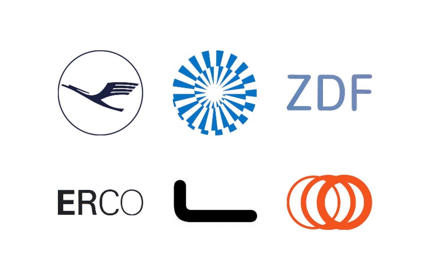
German designer Otl Aicher was known for his rigorous systems built from grids, carefully chosen typefaces, highly legible pictograms and restrained palettes.
From the 1960s to the late 1980s he and his studio created identities for an airline, a broadcaster, a lighting manufacturer, a maker of door handles and a metro system, and led the design of the 1972 Munich Olympics, for which Coordt von Mannstein designed the emblem as part of Aicher’s team.
Here are six logos by Otl Aicher and his team, from Lufthansa in 1962 to Metro Bilbao in 1988, and the stories behind their design.
Key Takeaways
Refining what exists
At Lufthansa, Aicher kept Otto Firle’s crane but gave it heavier lines, square terminals and a Helvetica wordmark.
Systems, not just symbols
For ZDF, ERCO and FSB, the logo was one part of a complete system of typography, colour and rules set out in manuals.
A lifetime of research
Pictograms, typefaces and ideas developed over decades fed into Metro Bilbao, one of Aicher’s last major commissions before his death in 1991.
Go behind the logos. Explore 200+ in-depth and meticulously researched logo histories revealing the designers, design decisions and ideas behind the world’s most iconic logos and important brand identities.
Continue reading to discover how Otl Aicher brought rigour and clarity to six of his best-known identities →

Lufthansa, 1962
The Lufthansa logo began life as the symbol of airline Deutsche Luft-Reederei, which was established in 1917 and began operations two years later in 1919.
It wasn’t until 1963, during a period of expansion and modernisation, which introduced the jet engine to the Lufthansa fleet, that the logo was formalised and a new visual developed under the direction of German designer Otl Aicher. Before settling on an update, various degrees of abstraction, between a crane and an arrow were explored.
Read the full Lufthansa story →

Munich ’72, 1968
The first German Summer Olympic Games was held in Berlin in 1936. What followed was the tragic and global upheaval of WWII. Eager to repair the damage, the West German Government saw the Munich Olympics, to take place in 1972, as an opportunity to present a democratic and optimistic Germany to the world. The official motto, "Die heiteren Spiele" or "The cheerful Games" captured this sentiment, and was a guiding light in the design of the Games’ visual identity, developed by Otl Aicher’s Dept. XI and overseen by Willi Daume, president of the West German Olympic Committee. The design of the Munich ’72 emblem was not straightforward. It went on to involve many designers, took over a year and cost 80,000DM.
The final design, as explained in the Munich ‘72 graphic standards manual, “is based on three basic geometric figures: an exterior circle, an interior circle and an Archimedean spiral whose radius is enlarged by an angle size of 15° at a consistent rate. The wedges that taper towards the inner circle result from a complicated division of the exterior circle into 35 ⅔ segments.”
Read the full Munich ’72 story →

ZDF, 1973
By the 1970s, it was felt that the fixed logo of the station was incompatible with the heterogeneous nature of its programming, which was fundamentally time and event sensitive, and manifold in its content. With this in mind, in 1973 Otl Aicher was commissioned to develop a corporate image ‘appropriate for a television channel’, one that could resolve the conflict between heterogeneous programming (in content, journalistic style and artistic expression) and a requirement to make each appearance of the ZDF enterprise identifiable and consistent, both on screen and throughout its print materials.
The common abbreviation ‘ZDF’, set in the new custom typeface, became the basis of a new logo. This abbreviation offered flexibility in application, with it being much shorter than the full name and limited the possible negative connotations related to ZDF being the ‘number 2’ station.

ERCO, 1976
The origin of the company’s 1976 corporate identity stemmed from the usage rights of the pictograms devised by Otl Aicher for the Munich Olympics. In the autumn of 1974 Aicher met with Klaus Jürgen Maack, managing director of ERCO, to sort out questions regarding the copyright of these pictograms as the lighting company wanted to use these in an illuminated signage system.
As an extension of this exploration, Aicher thought about typography as it related to light when he designed the new logotype for ERCO. Aicher did not consider using the sort of illustrative logo (such as a lamp or light bulb common to the industry and previous identity) but rather a more elegant solution with a greater degree of nuance. His design was a simple resolution of the complex requirements of light and architectural structure. The ERCO logotype developed represents more than just the name of the company; it expresses visually what the company does economically by way of four letters set in three weights of Univers (the final letter, the ‘O’, was custom drawn). These progressed from bold to light. The impression given is the logotype appears to incrementally illuminate, or dim when set on black. Aicher's logotype for ERCO conveys in a typographical manner ERCO’s desire to sell the idea of light rather than devices for illumination.

FSB, 1985
Despite a long and significant history, a growing building crisis in Germany at the beginning of the 1980s had FSB Managing Director Jürgen Werner Braun questioning the company’s approach to marketing as commissions had begun decline. He needed to rethink the way the products were presented and marketed.
The FSB letterforms placed alongside the new logo were drawn from ‘Traffic’ which Aicher had created for Munich’s public transport services. This introduced an important humanist element (an ergonomics for the eye) to the identity, with Trade Gothic and Univers being used as primary and secondary corporate typefaces, respectively.

Metro Bilbao, 1988
Aicher was asked by the architects to devise a ‘graphic design’ (visual identity and wayfinding) that would complement the overall architectural language and aid navigation through the new system. It would be an opportunity for Aicher to test much of the work he had done for German clients such as ERCO (coming soon to Logo Histories) and FSB outside of the country.
A key part of any metro system is a clear and identifiable symbol that could work for both regional and international visitors to the city. Rather than focus on an ‘M’ Aicher favoured an abstract form based on the notion of tunnels and wheels in motion. This was brought to life overlapping three rings of gradually increasing weight from left to right. This transitional gesture then generated the impression of forward momentum, conveying the dynamic qualities of tunnel transport. The logo also complemented the ring-like access points / canopies that covered the entrance to the Metro designed by Sir Norman Foster and partners.
Read the full Metro Bilbao story →
Read next
For more of this work, browse every Otl Aicher logo history in the archive, or see more of the best in the Top 10 logos of all time. Become a paid subscriber to read every story in full, richly illustrated.
Want more in-depth articles? Check out LogoHistories’ other articles on German design →


Thank you for subscribing to Logo Histories. If you enjoy reading this short you may also enjoy these resources from the same team:
Brand Archive – Research tool for brand designers.
LogoArchive Website – Searchable modernist logo archive & research tool.
LogoArchive Shop – Vintage design books & LogoArchive Zines.
BP&O – Contemporary design editorial.