


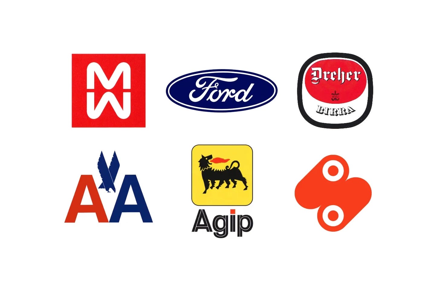
Founded in 1965 by Ralph Eckerstrom, Massimo Vignelli, Lella Vignelli, Bob Noorda, James Fogelman, Wally Gutches and Larry Klein, Unimark International brought a rational, systematic approach to corporate identity, built on grids, standard colours and a lot of Helvetica.
Rather than invent new symbols for their own sake, the studio often refined what clients already had, tidying Ford’s script-and-oval and AGIP’s six-legged dog, then made them work consistently across signage, vehicles and print.
Here are six logos by Unimark International and its founders, from Bob Noorda’s Milan Metro in 1962 to AGIP in 1971, and the stories behind their design.
Key Takeaways
Systems over symbols
Unimark’s grids, Helvetica and standard colours let clients such as Ford build consistent signage and materials around the world, and do so affordably.
Refine, don’t replace
Where a mark had equity, the studio cleaned it up, keeping Ford’s script-and-oval, AGIP’s six-legged dog and Dreher’s red oval.
Modernism at scale
From Milan’s metro to American Airlines, Unimark’s founders brought European rational design to transport, energy and consumer brands.
Go behind the logos. Explore 200+ in-depth and meticulously researched logo histories revealing the designers, design decisions and ideas behind the world’s most iconic logos and important brand identities.
Continue reading to discover how Unimark International and its founders brought order to six well-known identities →

Milan Metro, 1962
Linea Uno (Line 1) was the first underground rapid transport network to be built in Milan, Italy. It was first part of the Milan Metro, operated by ATM, that would eventually expand over the course of the following decades to include five lines connecting all parts of the city.
On the surface it was a mirrored double ‘M’, one below the other, and the initials of Milan Metro. Secondly, it was a graphic expression to be read as two Milans, existing above and below ground.
Read the full Milan Metro story →

Ford, 1965
Post-war expansion and globalisation had seen many American companies extend their operations overseas as a way to sustain growth and market value. Ahead of Ford’s plan to invest in further global reach (it was already exporting to Europe and South America), it sought to review its corporate identity and seek a fresh direction that would better support and position it for this new era. Part of this would include formalising aspects that had increasingly become incoherent among factories, showrooms, and divisions over time.
Despite Rand’s bold position, it would be Unimark that would secure the project with a proposal that did not focus on the logo. Rather than invent the new they refined the old, and suggested formalising and bringing into coherence all aspects of the brand, ultimately addressing key pain points and questions around expansion based on research they had gathered.

Dreher Birra, 1966
In order to accommodate the growing number of applications, Noorda devised a new logo. This responded to two needs. The first was to return to the shape and essentials of the original bottle label. The second was to make the logo easier to reproduce at any size and on any material.
The logo kept the label’s central red oval and the Dreher name, but placed these within a square-based outer form so it would make for better signage. The palette was reduced to three colours, white, red and black, so they could be reproduced economically on any surface.
Read the full Dreher Birra story →

American Airlines, 1967
Vignelli and Italian designer Heinz Waibl would lead the design of the new American corporate identity, which would cover all aspects of the airline, from its logo, colour palette and typeface to tickets, tags and livery design. Believing simplicity was better than complexity, much of what Vignelli and Waibl sought was efficiency and strength, ‘proceeding by logic, not emotion. Not trends and fashions’ stripping everything back to a single typeface, Haas Helvetica, and two colours – the national colours red and blue.
The rational stripped back approach would also extend to a logo, two initials, AA, distinguished from one another only by colour. This would function as a ‘secondary mark’, second to a full wordmark that removed the space between ‘American’ and ‘Airlines’. There were no other airline logos at the time that had taken this approach and afforded it differentiation. The project would later be said to have popularised the use of Helvetica in the United States. A stacked two line version would increase the flexibility where horizontal space was limited.
Read the full American Airlines story →

Mondi, 1970
To further the growth of the company, a new modern corporate image was needed and Mondi looked to Unimark International and American designer John Rieben to deliver this. He and his team were invited to develop a corporate identity “that would convey a strong, bold, and modern character and deliver a sense of movement and interest.” Having always wanted to work overseas and with a large design company, Rieben had spent a year and a half setting up a Unimark office in Johannesburg. It was from here that he created Mondi’s corporate identity.
Rieben then combines the concept of communication with the technical elements of paper production. “The vehicle of the message transmission is paper, stylised here by the outstanding elements in the manufacturing process - the blanket and rollers.” These would convey movement, energy, and continuous activity. Then, Rieben selectively filled in the solids to create the 3D shape of the rollers.

AGIP, 1971
The Milan office of Unimark International, headed by Dutch-born designer Bob Noorda, was commissioned to review and develop a new image for the corporation. This would be vast in scope, encompassing design for service stations, fuel pumps, packaging, signage, stationery, uniforms and the interiors of motel restaurants.
The six-legged dog had been well-received and had become familiar to the majority of Italian people. With this in mind, it was felt that the logo required only a small refinement and that the existing corporate image be formalised and augmented. The goal was to, not only modernise the AGIP image and reinforce its recognisability but to also use colour and shape to make it easier to use across advertising and packaging as it became increasingly diversified.
Read next
For more of this work, browse every Unimark logo history in the archive, or see more of the best in the Top 10 logos of all time. Become a paid subscriber to read every story in full, richly illustrated.
Want more in-depth articles? Check out LogoHistories’ other articles on Italian design →


Thank you for subscribing to Logo Histories. If you enjoy reading this short you may also enjoy these resources from the same team:
Brand Archive – Research tool for brand designers.
LogoArchive Website – Searchable modernist logo archive & research tool.
LogoArchive Shop – Vintage design books & LogoArchive Zines.
BP&O – Contemporary design editorial.