


How 1950s logo design changed
The 1950s marked a turning point in the history of corporate logos. Companies had used trademarks and identifying symbols for decades, but during the post-war period their role began to change. A logo became more than a mark stamped on a product or placed at the top or foot of an advertisement. It could become the centre of a coordinated visual identity.
Economic expansion, mass production and the rapid growth of consumer culture presented a new challenge and opportunity. Companies had far more surfaces to work with. They could project their brand through an expanding range of packaging, advertising, vehicle liveries, signage and printed materials. Television added another new medium, while transport and communications technologies brought businesses into contact with larger audiences. Consistency became a valuable asset and differentiator.
In 1951, William Golden’s CBS Eye demonstrated the power of a simple symbol repeatedly and creatively applied. Designed primarily for television, the eye became closely associated with the network through constant widespread exposure. Few logos were present in so many living rooms at the same time and so often. This was unprecedented.
Elsewhere, designers were tackling similar problems in very different industries.
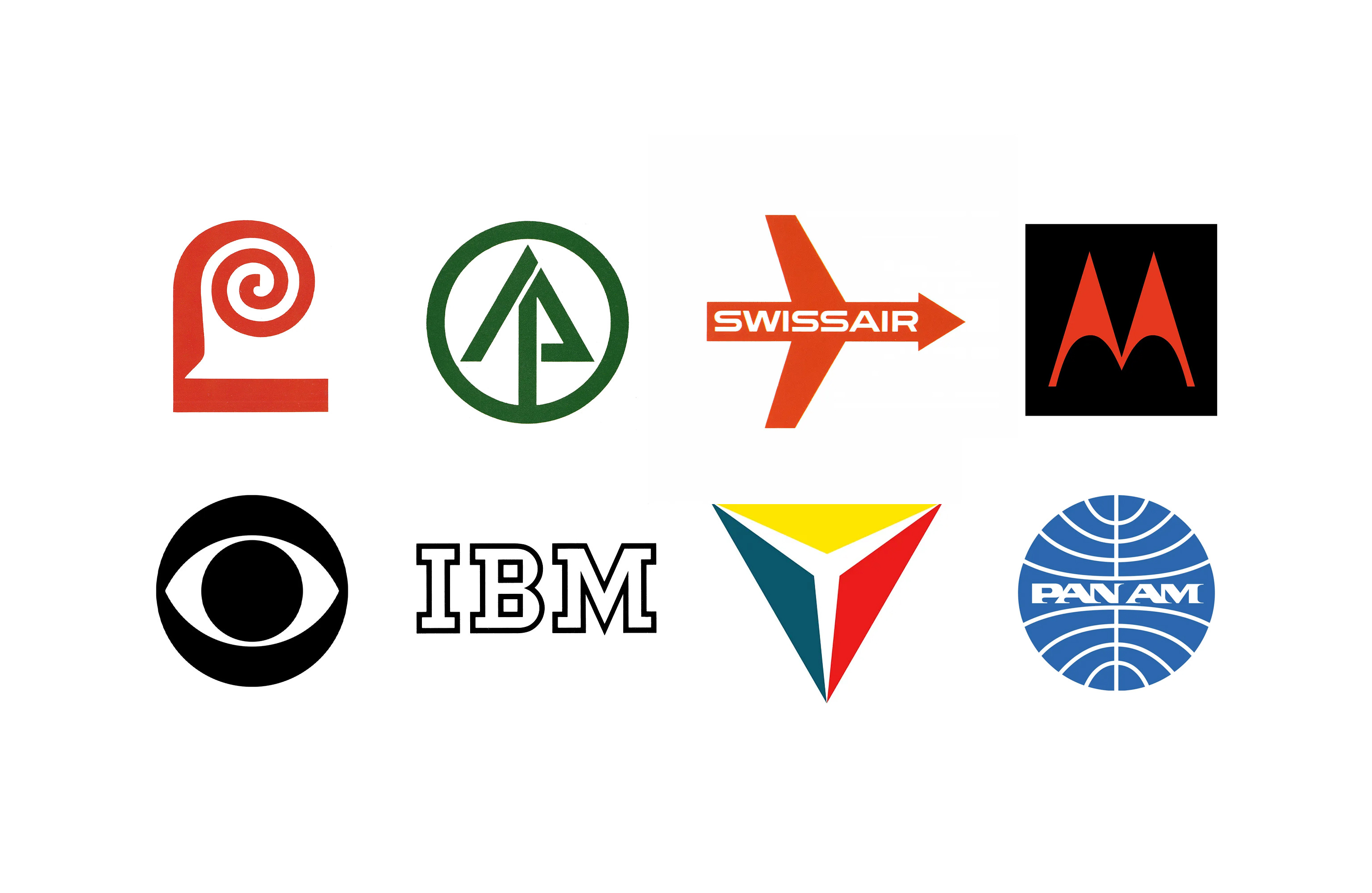
Herbert Matter brought a striking modern identity to New Haven Railroad in 1954, while Thomas Miller’s 1955 Motorola mark gave a growing electronics company a distinctive symbol as it expanded internationally. This international dimension moved logos away from specific regional or national motifs to those that would work further afield.
By the end of the decade, ambitions had grown.
For International Paper, Lester Beall developed not just a new mark but an identification programme. Research had shown that despite being the world’s largest manufacturer of printing papers, the company suffered from poor recognition and an inconsistent appearance. Beall’s 1958 logo could be scaled from stationery to trucks, signs to water towers, and was supported by a custom typeface and formulated colour palette. These were all codified in a comprehensive style manual, an early and fine example.
Saul Bass & Associates approached Lawry’s with similar breadth in 1959. The logo was designed to connect an expanding family of products, stand out on supermarket shelves and provide a recognisable identity under which the company could introduce new lines, to transfer the value, quality and expectations from one product to another. Brands became reassuring and easy choices, as supermarkets presented increasing choice.
The logo becomes infrastructure
These projects point towards an important change in thinking. The logo was becoming infrastructure.
It could organise the appearance of a company, connect otherwise disparate communications and build recognition through repetition. What had often been treated as an isolated trademark was becoming the anchor for something much larger: the corporate identity programme. From an economic perspective, these coordinated systems would build brand value.
The 1960s would push these ideas towards abstraction and systematic design, building more robust and scalable programmes. But many of the foundations were already being established during the previous decade.
Key Takeaways
From trademark to identity
In the 1950s, post-war expansion, mass production and television turned the logo from a mark on a product into the centre of a coordinated visual identity.
Recognition through repetition
William Golden’s 1951 CBS eye showed how a simple symbol, applied constantly and creatively, could build enormous recognition.
A foundation for the 1960s
By the end of the decade, Lester Beall’s International Paper and Saul Bass’ Lawry’s showed logos anchoring whole identification programmes, setting up the 1960s.
Go behind the logos. Explore 200+ in-depth and meticulously researched logo histories revealing the designers, design decisions and ideas behind the world’s most iconic logos and important brand identities.
→ free previews
→ join here
Continue reading to discover five landmark 1950s logos, from William Golden’s CBS eye to Saul Bass’ Lawry’s →
Five landmark 1950s logos

CBS Television Network, 1951
William Golden
Created primarily for on-air use, the CBS Eye became an early demonstration of how a simple symbol could accumulate enormous recognition through consistent but imaginative application.
Read the history of the CBS logo →

New Haven Railroad, 1954
Herbert Matter
Matter’s bold NH monogram brought European Modernist ideas to an American railroad, helping transform its public appearance during an era of growing competition from cars and airlines.
Discover the New Haven Railroad identity →

Motorola, 1955
Thomas Miller, Morton Goldsholl Associates
Two sharply pointed forms turned the initial M into a memorable symbol for a company moving rapidly from radio into television and other electronics, and expanding its production internationally.

International Paper, 1958
Lester Beall
A tree and the initials IP were compressed into a remarkably economical symbol. More importantly, the mark became the keystone of an extensive identification programme covering everything from stationery to industrial infrastructure.
Read the history of International Paper →

Lawry’s, 1959
Designed as Lawry’s moved beyond its original seasoning into a growing range of supermarket products, the identity shows corporate design principles being applied to consumer packaging and retail recognition.
Want more in-depth articles? Check out LogoHistories’ other articles on mid-century corporate identities →


LogoHistories is an independent publication documenting logo and corporate identity design history. Each of these has a fascinating story, some are familiar, others forgotten. LogoHistories exists to uncover these and then bring them to life. There’s so much more to uncover. A paid subscription helps us to continue to do this, it also gives you access to a growing archive of articles.