


In the 1960s and 1970s, car makers and the companies that supplied them grew from national manufacturers into international groups, selling cars, tractors, tyres and components across continents. Many reached that point with a patchwork of names, scripts and emblems that had drifted apart from factory to factory and showroom to showroom.
A new corporate identity brought order. Logos had to work at the scale of a dealership sign and the size of a badge, and on vehicles in motion, as described in A mobile medium.
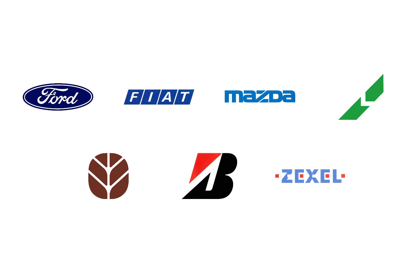
Here are seven car and automotive logos, from Unimark’s refinement of the Ford oval in 1965 to PAOS’ Zexel logotype in 1991, and the stories behind their design.
Key Takeaways
Identities for growing empires
Ford, Fiat, Bridgestone and Lucas had expanded into new markets and products, leaving identities that no longer matched the size or reach of the business.
Built to move
Slanted rhomboids, a cut ‘Z’ and the Lucas diagonal gave static logos a sense of speed, fitting for companies built around motion.
Systems, not just symbols
Unimark’s dealership grid, PAOS’ modular signage and Pentagram’s group identifier turned each logo into a system that could be applied consistently around the world.
Go behind the logos. Explore 200+ in-depth and meticulously researched logo histories revealing the designers, design decisions and ideas behind the world’s most iconic logos and important brand identities.
Continue reading to discover how seven car makers and suppliers turned ovals, rhomboids, diagonals and triangles into identities built for the road →

Ford, 1965
Increasing volatility in the markets of the 1960s, and the general mood in America and elsewhere was enough of a provocation for the leadership at Ford Motor Company (Ford) to look at ways of improving their position.
Post-war expansion and globalisation had seen many American companies extend their operations overseas as a way to sustain growth and market value. Ahead of Ford’s plan to invest in further global reach (it was already exporting to Europe and South America), it sought to review its corporate identity and seek a fresh direction that would better support and position it for this new era. Part of this would include formalising aspects that had increasingly become incoherent among factories, showrooms, and divisions over time.
The process would also seek to deliver cost savings through economies of scale as well as improving overall visibility and impact. This would extend to reviewing the Ford logo, a copperplate script, based on the signature of its founder Henry Ford.

Fiat, 1968
In 1899 a group of businessmen and professionals from Turin joined forces to realise a shared dream: to develop an Italian automobile factory that could offer ‘democratic mobility’ and cars ‘designed for life’. This ambitious automaker was Fiat.
By the mid-1960s, Fiat had grown to become the world's seventh largest car maker and had also expanded its manufacturing to include tractors for agriculture, civil and land engineering machinery, automobile components, diesel rail-cars and aero engines. Alongside this, Fiat was also involved in the raw materials trade. This expansion of products and materials catapulted the Italian manufacturer into the international market, distributing many of its products throughout Europe and the U.S.S.R, having taken a large share of the Italian auto market and seeking continued growth.
As the automaker expanded it was felt that its trademark (a logotype of condensed uppercase letterforms) didn’t reflect the increasingly modernised operation, nor its expanding international reach. The decision was made to embark upon the design of a new corporate identity, which would be launched to coincide with Fiat’s 70th anniversary. The project was initiated in 1968 and placed in the capable hands of Swiss designers Armin Vogt and Jean Reiwald.

Mazda, 1975
Toyo Kogyo Co., Ltd. was the first to develop the commercial application of rotary engines. Despite this technological achievement, it hadn’t been able to move its image away from being a manufacturer of three-wheeled service vehicles.
In 1971, in an effort to reposition the corporation as a leading manufacturer in the minds of consumers it launched ‘Project Eliza’. As part of this, a review of its corporate identity would be undertaken, standardising and bringing into coherence all aspects of its communications, future proofing the brand and providing it with a set of stock assets that would live for ‘as long as possible’.
Driving the development of the Mazda corporate image was Japanese design studio PAOS, who defined three ‘conceptual expressions’ to define all aspects of the new corporate identity; progressiveness, high quality and empathy.

Lucas Industries, 1975
Lucas Industries was a British manufacturer of automotive and aerospace components that grew, by the mid-1970s, into one of the largest of its kind in the world.
At the time, the corporate policy was to appear publicly as small in scale, even though it was significant and extensive. This policy, however, had brought about a complex tapestry of subsidiary names, trademarks and brands.
Confusion and managerial difficulties grew in tandem with the continued increase in subsidiaries. With this problem in mind, in 1975, the Lucas Group decided to introduce a new corporate identity system and logo that would unify all subsidiaries under a single corporate image and design policy. Lucas chose Pentagram, and founders Colin Forbes and Alan Fletcher, to develop a new brand architecture and corporate identity.
Read the full Lucas Industries story →

FiatAgri, 1977
In 1977, following a series of mergers and acquisitions, Fiat Trattori the agricultural division of Italian automotive manufacturer Fiat, became FiatAgri.
The logo for FiatAgri, designed by Carlo Malerba, alludes to plant growth and the treads of a tractor tyre on the ground: visualising the relationship between nature and industry.
The harmonic and symmetrical shape was designed to function in a variety of applications but, in particular, the branding of FiatAgri vehicles.
Read the full FiatAgri story →

Bridgestone, 1984
Bridgestone was founded as Bridgestone Tire Company, Ltd. in 1931 and was the first Japanese tyre maker to utilise domestically developed manufacturing technologies. By the mid-1950s the company had a major hold over the domestic market, and over the following years its business grew beyond tyres to include bicycles, sporting goods and other items, steadily strengthening its presence in overseas markets.
With its movement into new markets and product categories, Bridgestone's brands multiplied and grew in complexity. This had led to inconsistencies in design as this was tackled independently. At the beginning of the 1980s, and into its 50th year, Bridgestone embarked on a programme of studies, and followed this with a corporate identity (CI) that sought to address this issue of inconsistency. Further, the new CI intended to establish a system that would be better attuned to the company's marketing strategies going forward, consolidate its images across all of its products and marketing, and address three ‘forward-looking policies’. These were: greater penetration into the global markets; expansion of its scope of operations; and play a larger role in society.
Read the full Bridgestone story →

Zexel, 1991
In 1991, and on the 51st anniversary of its founding, the Japanese car parts company Diesel Kiki Co., Ltd. introduced a new corporate identity designed by PAOS.
This followed a meeting with shareholders, that agreed to change the name to ‘Zexel’ as a statement of a determination to refresh the ‘minds and bodies’ of the corporation and catalyse corporate development ahead of the 21st century as it developed its international business.
Read next
For more logos made for industry, browse the Industrial Logos collection, see more by the studios behind them in Unimark International, or discover Paul Rand’s unused Ford logo in Lost logos. Become a paid subscriber to read every story in full, richly illustrated.
Want more in-depth articles? Check out LogoHistories’ other articles on manufacturing logos →


