


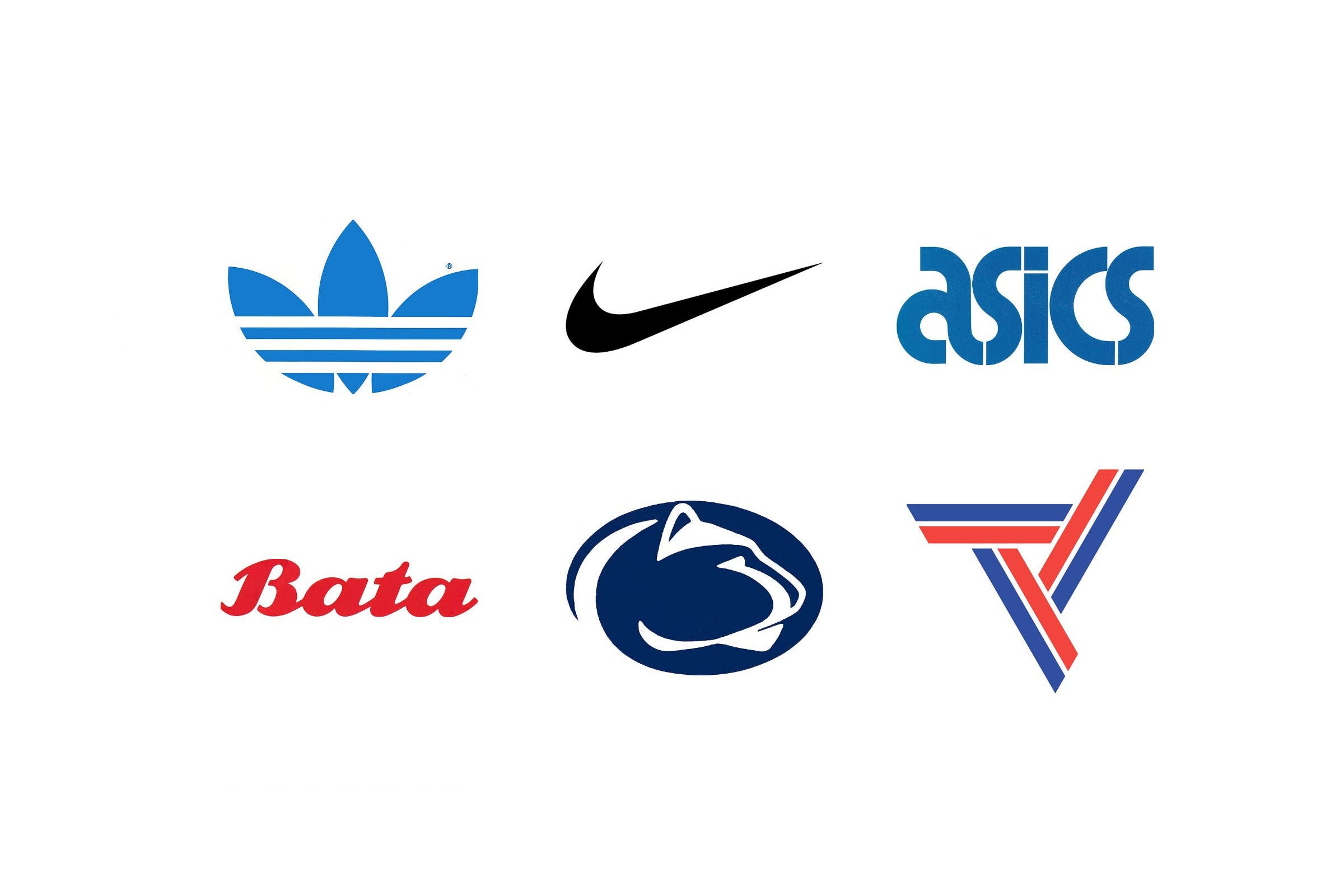
Few logos are seen as often, or worn as proudly, as sportswear logos. A swoosh, three leaves or a set of stripes has to work on a shoe, a shirt, a stadium hoarding and a television screen, often at speed and at a distance.
In this article you’ll find the stories behind the Nike Swoosh, the Adidas Trefoil, Herb Lubalin and Alan Peckolick’s logo for ASICS and Bata’s 1969 identity, followed by logos created for sports teams, associations and games. For the biggest sporting event of all, see our guide to Olympic logos.
Key Takeaways
Simple enough to read in motion
The strongest sportswear logos are bold, simple shapes that can be recognised on a moving shoe or a shirt across a stadium. The Swoosh and the Adidas stripes work at any size and from any distance.
Small fees, long lives
Carolyn Davidson was paid $35 for the Nike Swoosh in 1971, yet it has barely changed since. A strong, simple form can outlast every fashion around it.
Built to work everywhere
As brands grew, their logos had to work across products, shops and advertising. Design Research Unit standardised Bata’s identity across 5,000 stores worldwide, and Hans Fick’s Trefoil was created for the 1972 Munich Olympics.
Go behind the logos. Explore 200+ in-depth and meticulously researched logo histories revealing the designers, design decisions and ideas behind the world’s most iconic logos and important brand identities.
Continue reading to discover the stories behind seven classic sportswear and sports logos →
Sportswear and footwear logos

Nike, 1971
The first version of the Nike logo was created in 1971 by Portland State University student Carolyn Davidson. The requirement was to create a logo that conveyed motion, would differentiate it from the stripes of Adidas and fit the profile of a running shoe. For this, Davidson received a fee of $35.
Davidson met Phil Knight, co-founder of Nike (at the time Blue Ribbon Sports) at PSU where he taught. He had overheard Davidson mention she was unable to afford another class (she was studying journalism and would later move to graphic design), and offered her work as a part-time graphic artist producing graphs and charts. This relationship led to the commissioning of a new logo as Blue Ribbon Sports moved from distribution to design and manufacturing and became Nike.
Read the full Nike logo story →

Adidas, 1972
The West German sportsman and inventor Adolf Dassler was ahead of his time. Long before the creation of leisure wear and sports science, Dassler was endeavouring to perfect footwear for sports people.
Dassler set out first by making simple plimsolls in 1920, registering ‘Gebrüder Dassler Schuhfabrik’ in 1924. Later, in 1949, he would start over again and founded ‘Adi Dassler addas Sportschuhfabrik’. With a team of 47, he designed and registered the first sports shoe that featured three stripes.
A problem arose when Dassler went to register the company and the name 'addas'–a combination of his first and last name–was similar to an existing children's shoe business. Dassler then changed the company name to 'adidas', but not before printing his business cards.
Read the full Adidas logo story →

ASICS, 1977
Japanese sporting goods brand ASICS was formed from the merger of Onitsuka, GTO and Jelenk, and was launched on to the market in 1977.
The development of its corporate identity began with a competition, with Japanese design studio PAOS securing the work after submitting six different proposals. However, with ASICS looking to reach new markets, an international perspective was required. With this in mind PAOS commissioned renowned American graphic designer Herb Lubalin to work on the ASICS wordmark.
Read the full ASICS logo story →

Bata, 1969
Despite having its 1960s headquarters in the Canadian city of Toronto, the shoe manufacturer, distributor and retailer Bata was founded in Zlin, Czechoslovakia by Tomáš Baťa, a 9th generation shoemaker.
By 1969, 75 years after its founding, the Bata Shoe Organization was holding 98 Bata companies in 89 countries overseeing 90 factories, 5,000 stores and 90,000 employees. During this period of growth Bata maintained a strong focus on ‘producing and selling the best quality footwear at the most economical prices’. This had found it warmly welcomed in many countries.
Read the full Bata logo story →
Sports team, association and games logos

Penn State, 1983
In 1983, Penn State began developing a new visual identity for its Intercollegiate Athletic Department. The university wanted a single graphic image that could be applied consistently throughout its communications and network of 65,000 students across 22 campuses. A licensing committee also identified an opportunity to generate royalties through a distinctive, protected logo.
Read the full Penn State logo story →

United States Deaf Skiers Association, 1970
In 1970 David Leigh was invited to develop a new visual identity for the United States Deaf Skiers Association. As part of this, a new logo was sought, one that would be a memorable image for deaf skiers and also convey the seriousness and dignity of the group.
A key problem consisted of the need to create a symbol that was easily adaptable for a wide variety of use cases, from posters to letterheads, and all the way down to pin badges.
Leigh’s solution was the ‘Skimark’. This was composed of skiis pointing inwards and converging at a central point, then cropped into a snowflake-like circle, illustrating the unity of the association.
Read the full United States Deaf Skiers Association logo story →

Brisbane 1982 Commonwealth Games
In 1982 the Commonwealth Games landed in Australia. This ran from 30 September to 9 October in and around the city of Brisbane. Forty-six nations competed and a new record was set, with a total of 1,583 athletes and 571 officials taking part. Australia finished at the top of the medal table, ahead of England, Canada, Scotland and New Zealand.
At the opening ceremony–which took place in the QE II Jubilee Sports Centre, in the Brisbane suburb of Nathan–it was Matilda, a giant mechanical kangaroo, that stole the show. Matilda, the mascot of the Games, was designed by Hugh Edwards and was built as an impressive representation of the emblem of Australia. The logo however, which was also designed by Edwards, took a more abstract approach.
Read the full Brisbane 1982 Commonwealth Games logo story →
Want more? Explore the Olympic logos guide, or browse every logo history tagged sport.
Go behind the logos. Explore 200+ in-depth and meticulously researched logo histories revealing the designers, design decisions and ideas behind the world’s most iconic logos and important brand identities.