


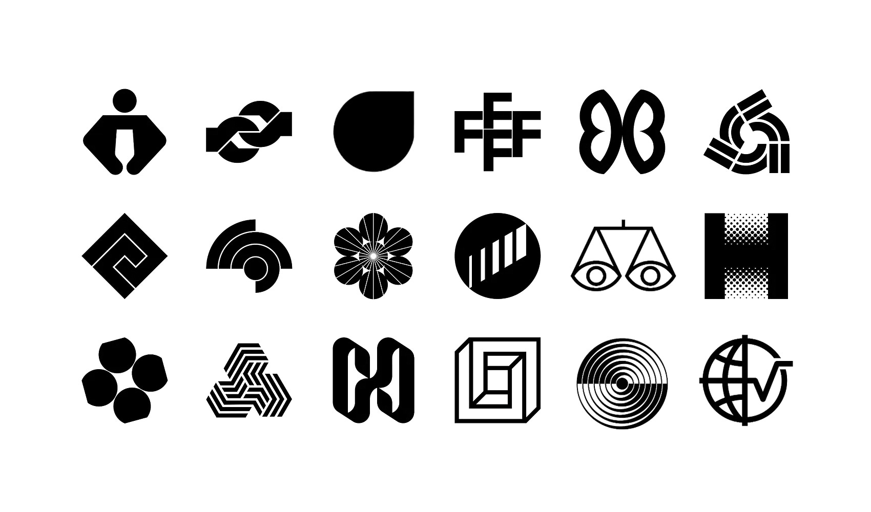
The best logos rarely rely on luck. Behind many of the most memorable marks of the twentieth century sit a handful of recurring visual techniques: ways of turning a letter, a shape or an everyday object into something distinctive, ownable and hard to forget.
Designers in the post-war period, from Bob Noorda and Margaret Calvert to Yusaku Kamekura and Félix Beltrán, returned to these techniques again and again, using negative space, repetition, rotation and optical illusion to say more with less.
Here are 18 logo design techniques, each explained with classic examples from the LogoArchive and each with its own in-depth guide.
Key Takeaways
Do more with less
Many techniques, from repetition and reflection to rotation and tessellation, start with a single simple form and multiply, mirror or turn it, adding meaning without adding complexity.
Make the viewer take part
Negative space, illusory contours and impossible forms invite the eye to complete or puzzle over a shape, and that small moment of discovery makes a logo more memorable.
Match the technique to the message
Each technique suits particular ideas, such as radiance for light and energy, extrusion for building and space, or transition for growth, so the right choice depends on what a logo needs to say.
Go behind the logos. Explore 200+ in-depth and meticulously researched logo histories revealing the designers, design decisions and ideas behind the world’s most iconic logos and important brand identities.
Continue reading to discover the 18 techniques behind some of the world’s most memorable logos →


1. Negative Space Logos
Positive and negative space have long played an important role in art, design and architecture, creating a critical interplay between what is present and what is absent. Sometimes this is used for compositional reasons; sometimes to communicate or allude to something further.
Read the full guide to negative space logos →

2. Figurative Logos
Unlike abstract art, figurative art is grounded in visible reality and clearly derived from real objects. Figurative logos similarly find their origins in the real world. However, because a logo must be owned and recognised, the designer goes one step further, offering an interpretation of the real world as a flat, simplified form.
Read the full guide to figurative logos →

3. Abstract Logos
Abstract logos occupy a curious position within the history of corporate identity. Unlike figurative or pictorial logos, which derive meaning from recognisable objects, abstract symbols begin without an obvious explanation. Their meaning has to be built. They are empty vessels waiting to be filled.
Read the full guide to abstract logos →

4. Repetition Logos
Repeating the same shape can imply further meaning. Techniques such as tessellating, stacking and mirroring each carry their own allusions. A tree becomes a forest, a person becomes a community, a book becomes a library.
Read the full guide to repetition logos →

5. Reflection Logos
The creativity here lies in the question ‘what else can be gained from what I already have?’ Instead of simply repeating a form, the designer draws an invisible line, often horizontal or vertical, occasionally diagonal, which acts as a mirror.
Read the full guide to reflection logos →

6. Rotation Logos
Logos with a rotating or spiralling component introduce a sense of motion to a static form. They typically turn around a single point, combining separate elements, offset or displaced at different angles, to create momentum.
Read the full guide to rotation logos →

7. Tessellating Logos
Tessellation is the arrangement of forms, loosely or tightly fitted, into a repeated pattern, sitting neatly beside one another or locked together to create a larger symbol.
Read the full guide to tessellating logos →

8. Concentric Logos
Concentric logos are those built, in whole or in part, around a common centre or axis. This often appears as offset lines, or as a logo constructed from several parts that share a centre point. The approach can lend a simple shape distinction, or allude to some aspect of a brand or service.
Read the full guide to concentric logos →

9. Radiant Logos
Radiant logos are expressive, conveying a sense of outward movement from a base or a central point. Although flat and static, a radiant logo creates the perception of dynamism. ‘Radial’ is perhaps the most common form, but there is also ‘linear’ radiance, as in Almando Ferraro’s 1982 logo for Junta Directiva Remavenca.
Read the full guide to radiant logos →

10. Transitional Logos
Transitional logos use a change of state to play with ideas such as growth, evolution and creation. This could be stepped line thicknesses, differing heights or smooth scaling.
Read the full guide to transitional logos →

11. Proximity Logos
Proximity describes the nearness of, and relationship between, objects in space. In logo design, it can be extended to the closeness of shapes and, specifically, of volumes. This focus on the relationship between volumes distinguishes the technique from others, such as the interplay of positive and negative space.
Read the full guide to proximity logos →

12. Halftone Logos
Halftone is a printing technique that uses patterns of differently sized dots to create the optical illusion of gradients. Larger dots, set closer together, form areas that appear darker, while smaller dots, with more space between them, make lighter areas.
Read the full guide to halftone logos →

13. Illusory Contour Logos
Illusory contours, also known as subjective contours, are visual illusions that evoke the perception of an edge where none is drawn. They encourage the viewer’s mind to complete images that are only partially formed or loosely implied.
Read the full guide to illusory contour logos →

14. Spatial Logos
Spatial logos cover a group of logo design techniques that includes extrusion logos and impossible forms: flat graphic shapes that appear to occupy three-dimensional space.
Read the full guide to spatial logos →

15. Extrusion Logos
The extruded logo subverts the flat surface of the page or screen by mimicking the perspective and depth of real-world objects. That tension makes a logo eye-catching and memorable.
Read the full guide to extrusion logos →

16. Impossible Logos
Impossible logos catch the eye through their close relationship with, and ultimate subversion of, the physical world. They twist and fold into themselves, creating a mystery and intrigue that aid recognition and recall.
Read the full guide to impossible logos →

17. Compounding Logos
Uniqueness of form and a duality of meaning can be found in the natural synergy and intersection of two or more ideas.
Read the full guide to compounding logos →

18. Narrative Logos
A logo should identify, be distinctive and work well in every relevant context. There are many ways of arriving at a logo that achieves these things. Some will say a logo doesn’t need to reflect the function, practices or situation of a business, but these can offer a starting point, or a route towards meeting those three foundational requirements.
Read the full guide to narrative logos →
Go behind the logos. Explore 200+ in-depth and meticulously researched logo histories revealing the designers, design decisions and ideas behind the world’s most iconic logos and important brand identities.