


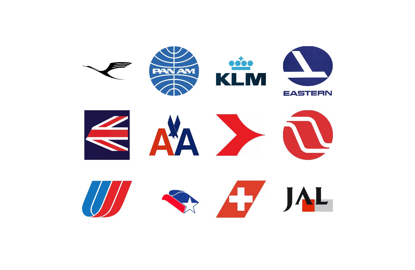
The arrival of commercial jets in the late 1950s transformed air travel, and with it the way airlines looked. Wide-bodied aircraft, falling fares and new international routes made the illustrated wings, eagles and globes of the propeller era look out of date, as described in Come the Jet Age.
Airlines needed identities that could be applied consistently around the world, from tail fins and check-in desks to tickets, uniforms and timetables. For national flag carriers the stakes were higher still, as a tail fin carried a country’s character into foreign airports.
Here are twelve airline logos and corporate identities, from Otto Firle’s Lufthansa crane in 1918 to Landor Associates’ Japan Airlines in 1989, and the stories behind their design.
Key Takeaways
Built for the jet age
New jets, routes and services exposed dated and inconsistent identities, prompting KLM, Eastern, American and Swissair to rationalise their logos, colours and typefaces.
A flag on the tail
As flag carriers, airlines such as BEA, Swissair and Lufthansa used national symbols to carry a country’s character into airports around the world.
Keep what passengers trust
Where a symbol had built up goodwill, designers modernised rather than replaced it: KLM kept its crown, Eastern its falcon and JAL its crane, while American’s staff demanded the return of the eagle.
Go behind the logos. Explore 200+ in-depth and meticulously researched logo histories revealing the designers, design decisions and ideas behind the world’s most iconic logos and important brand identities.
Continue reading to discover how twelve airlines turned cranes, crowns, flags and falcons into identities fit for the jet age →

Lufthansa, 1918–2018
The Lufthansa logo began life as the symbol of airline Deutsche Luft-Reederei, which was established in 1917 and began operations two years later in 1919.
In the intervening year of 1918, between its establishment and the beginning of commercial flights Professor Otto Firle designed the stylised and iconic bird in flight symbol.
Light and aerodynamic, the symbol delivered an efficient and elegant visual gesture, either alone, or sitting over the outline of sun or globe, bronze on blue.
Read the full Lufthansa story →

Pan Am, 1957
In 1955 architect Edward Barnes was hired as a design consultant for Pan American Airways just as the company began to introduce commercial jets to the American airline market.
The half wing symbol, a motif that had become increasingly common in aviation and used since 1928, was replaced with a globe with fine curved lines of negative space intersecting it. This was colloquially known as the ‘blue ball’ and was a bold and modernist expression, well ahead of its time that avoided specific geographic representation, instead, favouring an abstract vision of a world without borders, fitting for the dawning of a new age of commercial aviation.

KLM, 1961
Although KLM management were said to have been open to an entirely new logo, market research had suggested that the initials KLM, the crown and the stripes were well-established. They were widely recognised and carried with them the association of goodwill on the part of passengers. However, these elements were lacking a sense of modernity and a coherently governed design policy as it continued to grow.
Improvements came in a change from diagonal to horizontal stripes, reducing the number and increasing the thickness. This new configuration maintained the same direction on either side of vehicles and the overall impression was simpler, bolder and more immediate, especially from a distance.

Eastern Airlines, 1964
At the start of the 1960s, Eastern Airlines (Eastern) was in financial turmoil. The arrival of the jet age and greater competition had taken its toll, and was further compounded by being led by a CEO with little experience of running an airline. The start of the decade was also marred by tragedy, as several fatal plane crashes had killed over 200 passengers between 1960 and 1965. Alongside this, the North American airline had a reputation for bad service with delayed and cancelled flights and instances of missing luggage. Some had even considered the airline cursed. When Floyd Hall was hired as president in 1964, the airline was at its worst, with a deficit of $70 million.
Eager to restore the image of Eastern and show passengers that changes were being made, Floyd Hall reached out to Lippincott & Margulies (Amtrak, Coop). The consultancy was retained to conduct market research and produce a new, improved corporate identity that would encompass all aspects of the airline, from aeroplane liveries down to uniforms, tickets and in-flight menus. This intended to, not only help shift perceptions amongst travellers, but also provide an opportunity for the airline to rethink its day-to-day running, streamline its managerial tasks and project a new sense of modernity and strength.
Read the full Eastern Airlines story →

British European Airways, 1967
Since its founding in 1946, British European Airways (BEA) had had a long history of using modern communications design: Theyre Lee-Elliott (1903-1988) who created the “Key to Europe” BEA symbol and Jozef Müller-Brockmann (1914-1996) both provided strong posters promoting air travel to the Continent of Europe. BEA was also the first airline to roll out pioneering corporate identity programmes across two generations.
Virtually no airline had utilised a national flag as an insignia for aircraft livery before. And this is why the new program by FHK Henrion was so unique. The Union Jack, the official flag of the United Kingdom of Great Britain and Northern Ireland, was cropped at the same angle as the leading edge of the vertical stabilizer to create a striking new form.
Read the full British European Airways story →

American Airlines, 1967
Vignelli and Italian designer Heinz Waibl would lead the design of the new American corporate identity, which would cover all aspects of the airline, from its logo, colour palette and typeface to tickets, tags and livery design. Believing simplicity was better than complexity, much of what Vignelli and Waibl sought was efficiency and strength, ‘proceeding by logic, not emotion. Not trends and fashions’ stripping everything back to a single typeface, Haas Helvetica, and two colours – the national colours red and blue.
The rational stripped back approach would also extend to a logo, two initials, AA, distinguished from one another only by colour. This would function as a ‘secondary mark’, second to a full wordmark that removed the space between ‘American’ and ‘Airlines’. There were no other airline logos at the time that had taken this approach and afforded it differentiation. The project would later be said to have popularised the use of Helvetica in the United States. A stacked two line version would increase the flexibility where horizontal space was limited.
Read the full American Airlines story →

Austrian Airlines, 1969
In 1963, Austrian Airlines, Osterreichische Luft-verkehre-AG, settled on the abbreviation “AUA”. Unfortunately, this alphabetic combination was one of many that was not well-received internationally, and contributed to negative associations in German-speaking countries. Aiming to improve their overall corporate image, Austrian Airlines staged a competition in 1969 to find a new logo. Unusually, the participants were Viennese design students.
From an initial pool of over 200 entries, the winning design, by Josef Oberauer, was selected. The design depicted a stylised aircraft in the form of a chevron arrow facing right; the reverse of the arrow is sharp and rectilinear, with a curved and tapered point at the front. The result is an arrow that communicates direction whilst simultaneously suggesting a streamlined and dynamic shape, ready for flight.
Read the full Austrian Airlines story →

Northwest Orient, 1969
In the early part of the 1950s, having established its transpacific routes, Northwest Airlines–previously Northwest Airways–began trading as Northwest Orient Airline and pushed ahead with expansion. This expansion introduced new aircraft to the fleet, increasing flights, speed and passenger volume, and improving overall comfort. However, as the airline grew its fleets and destinations, by the late 1960s a mix of fonts, colours and various other design elements, as well as inconsistent naming which included Northwest, Northwest Airlines, Northwest Orient and NWA, had led to a ‘communicative dissonance’ in the marketing of the airline to potential passengers. With this in mind, Northwest Orient Airlines sought out a designer to develop a unified corporate image and logo.
The responsibility of designing what came to be known as ‘the meatball’, was given to Clarence Lee, a designer Moon had met in Hawaii and felt was better-suited to the job.
‘The meatball’, designed by Lee, integrates three different elements; the tail of an aircraft, the suggestion of a point towards the northwest and a roundel from which the aircraft tail was knocked out of as an outline.
Read the full Northwest Orient story →

United Airlines, 1974
By the early 1970s United Airlines had grown to become the largest domestic airline in the USA. Its success had followed a period of financial hardship, so the general sentiment was one of achievement. To reflect the change and growth of the company, it was proposed that the airline embark on a new visual identity programme. However, for many, this came unexpectedly. "The traditionalists may contend that a company which has achieved an outstanding record like United's should not tamper with its symbols and colours," said Richard J. Ferris, group vice-president of marketing services. "We disagree."
Leading the new visual identity programme was Saul Bass, long-ranked as a leading American designer and renowned for his work in corporate identity programmes, films, and packaging. His Los Angeles-based design company, Bass and Associates was approached to analyse and assess the airline's needs, and devise a cohesive visual language that would best appeal to the target demographic. They worked with the airline for two years, researching the public opinion of the airline. Having defined the necessary objectives, the management advisory communications firm tested and analysed ‘hundreds’ of logos, typographic styles and colourways in pursuit of the right one.
Read the full United Airlines story →

LanChile, 1975
To support the airline’s continued growth in 1975 a working group consisting of graphic designers, design students, industrial designers, architects and sociologists was established to develop a new image for the airline, with Olaf Leu being commissioned to develop a fresh Lan-Chile logo and identity.
The condor, Chile’s national emblem, seemed fitting. With this combination, and the addition of red and blue, and the dynamic upwards momentum of the overall composition, the design became a contemporary version of the country’s coat of arms. The condor was well-suited to being ‘carried away’ on the aircraft and a proud flying symbol.
Read the full LanChile story →

Swissair, 1978
In the process of modernising their fleet and ahead of their upcoming 50th anniversary in 1981, Swissair commissioned Swiss designer Karl Gerstner to develop a fresh new livery for its aircraft. Gerstner went all in, presenting Swissair with a completely new visual identity and logo design.
By placing the Swiss Cross within a parallelogram Gerstner emphasised the national character of Swissair, its position as the nation’s flag carrier, and represented Switzerland more plainly than any other logo could do. Further, within a parallelogram the cross gained distinction, a dynamic character and, outside the context of the aircraft tail, connected all materials produced by the airline to the image of flight.
Read the full Swissair story →

Japan Airlines, 1989
These broad strategic changes were a bold step forward by JAL, and needed to be clearly and outwardly expressed with a strong and unified corporate image. In 1989 American design studio Landor Associates were brought in to develop this new image, which would go on to include a new logo, colour palette, typeface and uniforms whilst retaining the iconic crane that had emblazoned the airline’s tail fins since 1958.
Landor Associates introduced a new customised JAL logotype set over a red square and a grey band. The upright and customised serif letterforms, which removed the bar of the ‘A’, intended to express a sincerity and solidity, with the red square adding a youthful energy. In addition, a band in a ‘business-like’ tone of grey–which would expand and contract, sometimes running the full width of the check-in desks and along half the body of aircraft–sought to reflect JAL's sense of dynamism and speed. Frutiger, a widely-available typeface, was introduced to unify various services (Executive and First) under the new logo.
Read the full Japan Airlines story →
Read next
For more logos made for air travel, browse every airline logo history in the archive, or see more of the best in the Top 10 logos of all time. Become a paid subscriber to read every story in full, richly illustrated.
Want more in-depth articles? Check out LogoHistories’ other articles on transport logos →


Thank you for subscribing to Logo Histories. If you enjoy reading this short you may also enjoy these resources from the same team:
Brand Archive – Research tool for brand designers.
LogoArchive Website – Searchable modernist logo archive & research tool.
LogoArchive Shop – Vintage design books & LogoArchive Zines.
BP&O – Contemporary design editorial.