


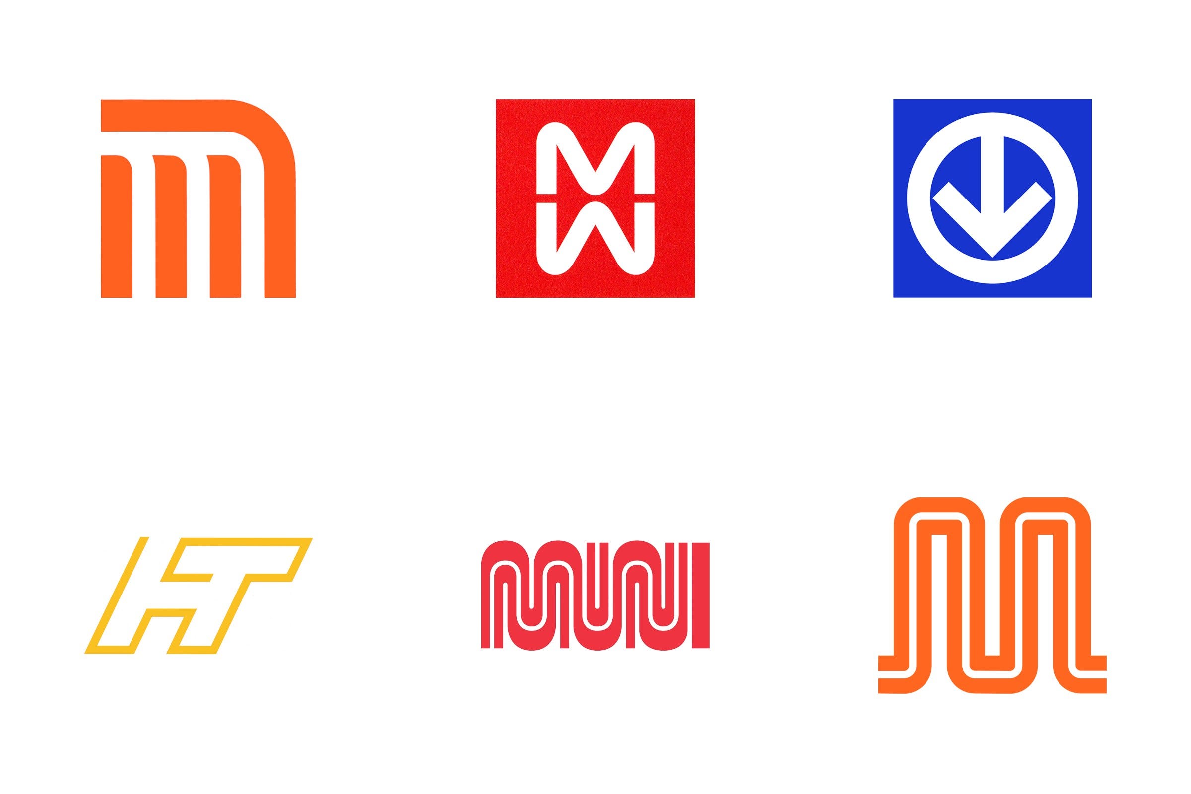
A transport logo is read by millions of people a day, often in a hurry, underground or from a moving vehicle. It has to mark a station entrance from across the street, sit on a ticket, a map and the side of a bus, and work for people who don’t speak the local language.
In this article you’ll find the histories behind metro and subway logos from Mexico City, Milan, Montréal, Bilbao and San Francisco, followed by city transport networks, ports and shipping lines, and a selection of national railways. For trains and planes, see our guides to railway logos and airline logos.
Key Takeaways
Signs before symbols
A metro logo often doubles as a sign, marking the way in from the street. Mexico City’s logo was developed as part of a complete wayfinding system for the network.
One letter, one idea
Many metro logos start from a single letter. Mexico City and Milan both built their marks around an M, drawn simply enough to be read at a glance.
One identity for many modes
City transport authorities such as Greater Manchester Transport and Copenhagen’s HT used a single identity to tie buses, trains and services into one recognisable network.
Go behind the logos. Explore 200+ in-depth and meticulously researched logo histories revealing the designers, design decisions and ideas behind the world’s most iconic logos and important brand identities.
Continue reading to discover the stories behind thirteen metro, transit, shipping and railway logos →
Metro and subway logos

Mexico City Metro, 1969
With congested roads and highways the Mexico City of the mid-twentieth century was experiencing an increasing public transport issue. Drawing on the technical assistance of France, and employing a tyre and rail approach by 1969 a distinctive orange metro train made its inaugural trip from Zaragoza, kicking off daily the operations of the Mexico City Metro. Despite the speed at which this was implemented, and the technical feats achieved, it would be the signage system that would generate the most amount of both praise and division.
The visual identity and signage system of this new metro was the result of a collaborative effort, a cross-disciplinary team of architects, photographers and graphic designers. These included Arturo Quiñones and Francisco Gallardo led by Lance Wyman, who worked with ISTME (Mexican Society of Engineers, Ingenieros en Sistemas de Transporte Metropolitano) under the coordination of architect Pedro Ramírez Vázquez. Wyman and Vázquez had previously worked together on the identity for the Mexico 1968 Summer Olympic Games four years earlier which had made a significant impression on the city.
Read the full Mexico City Metro logo story →

Milan Metro, 1962
Linea Uno (Line 1) was the first underground rapid transport network to be built in Milan, Italy. It was the first part of the Milan Metro, operated by ATM, that would eventually expand over the course of the following decades to include five lines connecting all parts of the city.
Work began on Linea Uno in 1957, with the initial section linking Sesto Marelli to Lotto, opening on November 1st 1964. Ahead of this, in 1962, the Società Metropolitana Milanese commissioned renowned architects Franco Albini and Franca Helg (Franco Albini-Franca Helg architecture studio) to develop station designs and pioneering designer Bob Noorda (Unimark International) to work on wayfinding and symbol.
Read the full Milan Metro logo story →

Montréal Métro, 1963
The Canadian province of Quebec saw continuous economic growth in the decades following World War 2. The 1960 provincial election became a further catalyst for change as the Liberal Party were brought to power following a period of socio-economic and socio-cultural dissatisfaction. This movement, known as The Quiet Revolution, led to major changes in social policy, education, and healthcare.
Thanks to a surge of industrial design projects, Quebec’s leading city of Montréal underwent a period of revitalisation. Notably, the 1960 re-election of Mayor Jean Drapeau led to further modernisation for the city. Fulfilling a campaign promise, Drapeau initiated the construction of the city’s first underground rapid transport system.
The proposal for the Montréal Métro was unveiled in 1961 and construction on the first two lines, Green and Orange, began in 1962. These were completed in 1966, with a third Yeollow line following in 1967. Serving these lines was a new train design created by Québécois design company Jacques S. Guillon & Associates, who were also responsible for the metro’s signage and logo design.
Read the full Montréal Métro logo story →

Metro Bilbao, 1988
The Bilbao metro, known as Metro de Bilbao in Spanish and Bilboko Metroa in Basque, is a public transit system serving the city of Bilbao and the Greater Bilbao region. The idea of a two line Bilbao Metro connecting Atxuri station to the city's westernmost areas was first put forward in the 1920s. However, financial backing from Banco Español de Crédito fell through in 1925, leading to the project's abandonment.
The idea was picked back up in 1971 when a commission was formed to assess the city’s transportation needs, which then gained governmental support in 1974. The Biscay Transport Consortium was established in 1977 and three proposals were considered. Despite eventual approval of one, objections and disagreements halted the project.
Read the full Metro Bilbao logo story →

MUNI, 1974
By the early 1970s, the visual identity of the San Francisco Municipal Railway (Muni) had started to lack coherence. Vehicles carried several different colour schemes and two different logos.
As a new light-rail system was being built it was felt that Muni also needed an identity that would be capable of unifying its expanding services and present the transport network as being more modern.
Read the full MUNI logo story →
City transport logos

Greater Manchester Transport, 1974
Greater Manchester Passenger Transport Executive (abbreviated to GMPTE) was a British public service originally formed in 1969 as ‘South East Lancashire North East Cheshire’, more commonly referred to as SELNEC.
SELNEC had branded its transport network and vehicles with a ‘dynamic S’ and an italic wordmark set through the centre, and employed an orange and white colour palette.
To differentiate each of the divisions that made up SELNEC the ’S’ was given a unique colour: magenta for Northern, blue for Central and green for Southern. For corporate operations, the parcel operations and coaching fleet, the 'S' remained orange.
Read the full Greater Manchester Transport logo story →

HT Copenhagen, 1985
The story of the “Capital Region's Traffic Company”, Hovedstadsområdets Trafikselskab (HT), begins in 1974, with the takeover of 12 publicly owned (or majority owned) bus companies. Beginning operations on the 1st October that year, it would be Denmark’s first regional transport company and responsible for public buses in Copenhagen’s Capital City area. Owing to the various manufacturers and age of the near 1000 bus fleet, HT set about standardising it with repaints.
Their 10-year anniversary was marked with growing pains, which were further exacerbated by several drivers’ strikes in early 1980s which had resulted in high-profile legal conflicts. Change was in order. An underlying belief for Hovedstadsområdets Trafikselskab (HT) was that good design would create a good travelling experience. “A bus with happy, well coordinated colours, with comfortable seats, and surfaces which are pleasant to touch, all contribute to making the journey an experience.” said Erik Davidsen, of the Greater Copenhagen Traffic Board.
Read the full HT Copenhagen logo story →

Golden Gate Transit
Golden Gate Bridge, Highway and Transportation District operates three key transport aspects of the Golden Gate Corridor; the Golden Gate Bridge (1937), the Golden Gate Ferry (1970) and bus service Golden Gate Transit (1972).
This network of transport services was created to link Marin County, north of San Francisco, with the City, and alleviate traffic congestion, reduce pollution and take over an unprofitable commuter bus service.
Read the full Golden Gate Transit logo story →
Port and shipping logos

British Transport Docks Board, 1965
The Transport Act was implemented in Great Britain in the early 1960s to re-organise the nationalised transport system. This triggered the dissolution of the British Transport Commission whose assets would then be allocated to five ‘successor bodies’. One of these would be the British Transport Docks Board (BTDB), which would oversee the management of former railway-owned docks throughout the country. On its formation, the board had no established design policy. And a report by Planned Public Relations Ltd in 1964 stated that BTDB was in need of a recognisable, unique and future-facing corporate identity that would help distinguish it from other transport corporations such as British Rail, whose groundbreaking corporate identity, nearly nine years in the making, was about to launch.
Read the full British Transport Docks Board logo story →

Holland America Line, 1969
Concorde made its maiden test flight in 1969, taking commercial air travel supersonic. The technical developments in air travel had sunk the traditional role of passenger boats. For those that had time and money, cruises became a luxury experience, leaving the rest as cargo and container ships servicing international trade. Corporations with fleets diversified and expanded into both to safeguard their interests under quickly evolving market conditions.
The golden era of transatlantic passenger ships had ended, and in 1969, faced with this and substantial consumer changes in taste, Holland America Line commissioned Dutch designer Will Van Sambeek to develop a new logo and corporate image to better position them for the future.
Read the full Holland America Line logo story →
National railway logos
Three of the national railway identities from our guide to railway logo design, which covers many more.

Amtrak, 1971
In 1960s America, the locomotive industry was nearing a crisis point. Rail was competing with newer modes of transport in an era that saw significant developments throughout the automotive industry; from rising international vehicle imports to improved interstate road networks. A huge impact came from mail services which began to favour trucks and air transport. Rail saw a substantial loss in revenue, from both passengers and business, contributing to the discontinuation of many trains and routes.
Rescue came in the form of the National Railroad Passenger Corporation (NRPC), a private entity that would receive taxpayer funding and operate the country’s intercity passenger rail system. This was newly formed after the Rail Passenger Service Act was passed in Congress, and signed into law by Nixon, in October 1970.
Read the full Amtrak logo story →

Swiss Federal Railways (SBB), 1972
By the 1970s, just like rail networks across Europe (British Rail, Nederlandse Spoorwegen), Swiss Federal Railways (SBB) was facing a range of challenges, from growing private car ownership to the increasing complexity of its network. Adding to this pressure was the reality that SBB shared the national railway system with over 100 private railways adding to potential confusion and competition. It was felt that a clearer identity, one that would distinguish SBB from other services and position it as a modernised and reliable transport option (reflecting investment in new infrastructure) was essential to its future growth.
With these requirements in mind, in 1978 SBB engaged the advertising and design agency of Müller-Brockmann + Co. to develop a standardised signage system that would cover all its railway stations and stops throughout the country, and establish the necessary framework for an overall visual image that would be associated with SBB going forward.
Read the full Swiss Federal Railways (SBB) logo story →

Nederlandse Spoorwegen, 1967
Just like the rail networks of the United States (AMTRAK), the United Kingdom (British Rail), and Canada (Canada National Railways) the pressures of private car ownership and the commercialisation of air travel began to affect the rail network of post-war Netherlands. In the face of these pressures, Nederlandse Spoorwegen (NS), the national rail network, began looking at developing a policy of reorganisation and improvement. Part of this would include the modernisation of its image.
The process of modernising began in 1967 by looking to other countries for successful examples. One of these was the work that Design Research Unit had done for British Rail in 1965. G. Williams, who had been part of the British Railways corporate image (CI) programme, was invited to share his experiences. As well as looking at rail projects, inspiration also came from the other pioneering CI programmes of the 1960s. These included airline KLM by FHK Henrion and PAM by Total Design.
Read the full Nederlandse Spoorwegen logo story →
Want more? Browse every logo history tagged transport, rail and wayfinding.
Go behind the logos. Explore 200+ in-depth and meticulously researched logo histories revealing the designers, design decisions and ideas behind the world’s most iconic logos and important brand identities.