


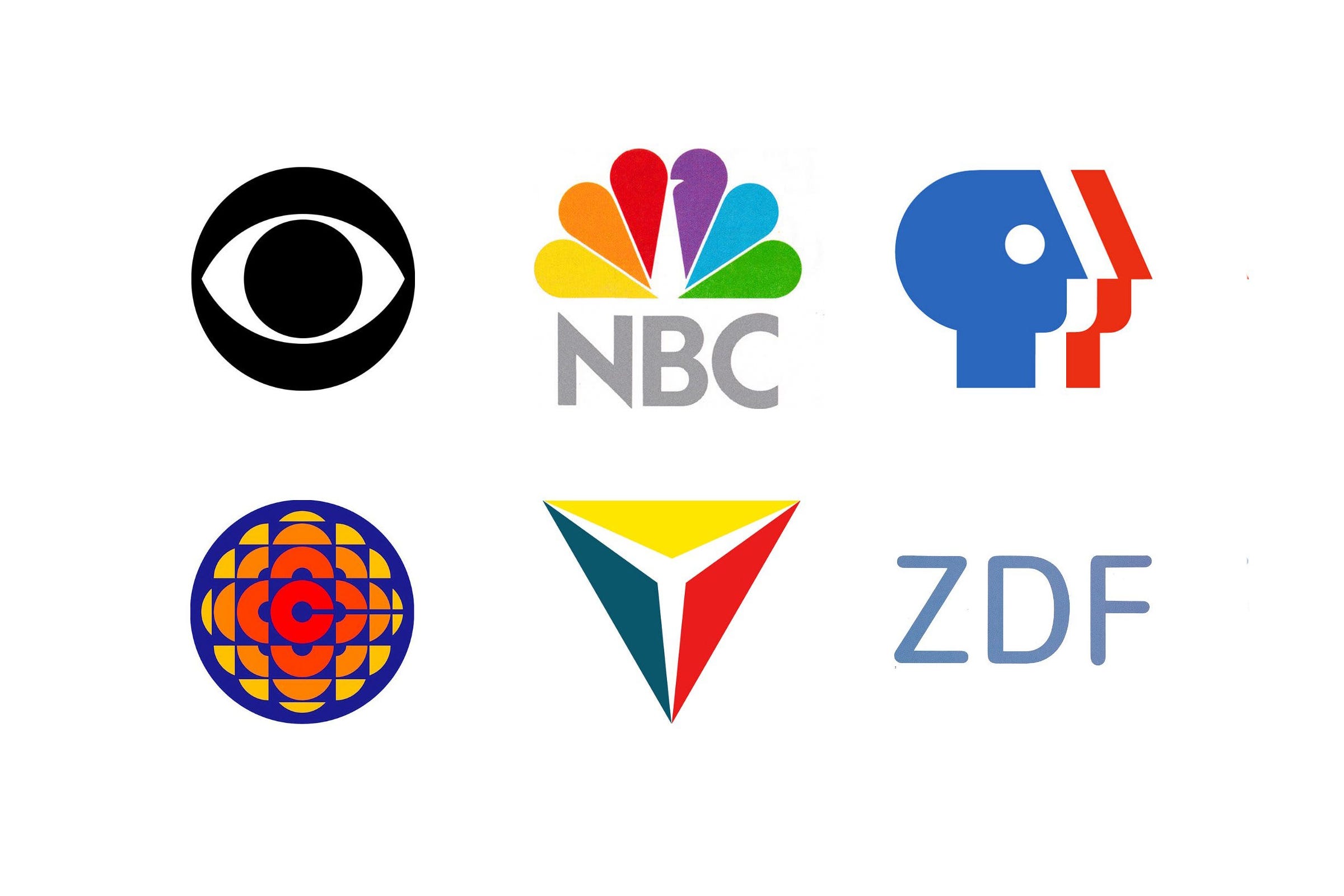
A television logo has a job few other marks share. It has to hold its own in the corner of a screen, open and close programmes and, later, move, all while viewers decide whether to change the channel.
In this article you’ll find the histories behind America’s best-known network logos, including the CBS eye, the NBC peacock and the PBS faces, followed by broadcasters from Canada, Britain, Germany and Japan.
Key Takeaways
Symbols that outlast programmes
William Golden’s CBS eye has been in use since 1951. A simple, ownable symbol can carry a network through decades of changing schedules and technology.
Designed for colour
The NBC peacock was created to announce colour television, and CBC marked its own move to colour with a symbol of its own. Colour itself became the message.
Public money, public scrutiny
When PBS replaced Herb Lubalin’s 1971 logo with Chermayeff & Geismar’s faces in 1984, one critic called it ‘a waste of public funds’. Publicly funded identities face questions commercial ones rarely do.
Go behind the logos. Explore 200+ in-depth and meticulously researched logo histories revealing the designers, design decisions and ideas behind the world’s most iconic logos and important brand identities.
Continue reading to discover the stories behind eleven classic TV and broadcasting logos →
US network and media logos

CBS, 1951
In under a decade, television ownership in the United States went from 20 to 90%. This potential for significant growth was evident, even in the early part of the 1950s. Recognising this, Columbia Broadcasting System split into two dedicated networks for television and radio, and directed to do everything possible to create their own distinct identities.
When CBS Television Network (CBS) debuted the first documentary series "See It Now” and captured the broadcasting spotlight when it premiered "I Love Lucy" CBS President Frank Stanton saw an opportunity to capitalise on this new interest by introducing a new corporate identity. The responsibility for developing this fell to William Golden. Golden had started his career in the CBS Radio promotion department in 1937 and, by 1951, had worked his way up to creative director of advertising and sales promotion.
Read the full CBS logo story →

NBC, 1986
Since its launch in 1926 as the National Broadcasting Company and America’s first radio network, NBC has been at the forefront of the media landscape. Over the decades, it evolved to meet the demands of an ever-changing viewership through technology and programming.
One of the most recognisable elements of NBC’s visual identity is the NBC Peacock, which has stood as a ‘symbol of innovation and excellence’ since its introduction in 1956. The first version was created by Herb Lubalin (ASICS) at Sudler & Hennessey and NBC Design Director John J. Graham, and was used as a promotional device, announcing the arrival of colour television but not as an official trademark. The design’s multi-coloured plumage was an effort to tie the broadcaster to the future and make the most of new colour technology.
Read the full NBC logo story →

PBS, 1971 and 1984
In 1971 PBS had a problem. Despite having over 200 TV stations across the United States viewers thought of these as being local rather than part of a national broadcasting network. As a non-commercial and publicly funded organisation, developing a sense of scale and authority would be essential in positioning itself against those that were commercially funded as it sought to grow further.
To develop a more ‘national image’ the broadcaster worked with renowned American designer Herb Lubalin (ASICS) to create a new logo. This would replace the basic wordmark, set in an uppercase sans serif, and employing three colours that was used at launch in 1970. Lubalin explored a number of options.
Read the full PBS, 1971 and 1984 logo story →

PBS: ‘A Waste of Public Funds’, 1984
Bob Michals, Palm Beach Post, Monday, April 16th, 1984–Having spent a couple of years with advertising agencies myself, I know all the arguments about the importance of a striking corporate logo, but it seems to me the Public Broadcasting Service has got to have something better to do with our money than pay for the modification of a symbol I, for one, thought was perfectly adequate to begin with.
In fact, in some ways the old symbol — which spelled out PBS — was actually vastly superior because the ideal corporate logo can stand alone without any additional text and still be readily identifiable by the public. The new logo simply consists of a silhouetted face that the design firm Chermayeff and Geismar Associates claims symbolically represents "everyone”.
Read the full PBS logo story →

WCVB Channel 5, 1972
In 1969, Boston Broadcasters promised that they would air more local programs than any other station in the United States. This bold claim led to them winning a construction permit to build a new television station on channel 5, in the city of Boston Massachusetts. They would become the city's new ABC affiliate, WCVB-TV - Channel 5, and replace the previous channel 5 occupants who were being investigated for allegations of impropriety.
To design the new logo and corporate identity, Boston Broadcasters approached graphic design firm Wyman & Cannan. The firm, founded by designers and former colleagues Bill Cannan and Lance Wyman, was formed following Wyman’s return to New York in 1970. The pair had previously worked together at George Nelson & Company, before Wyman departed to spend several successful years designing many well-known logos in Mexico, including the Mexico ’68 Olympic symbol.
Read the full WCVB Channel 5 logo story →

RCA, 1967
Radio Corporation of America, since its founding in 1919, had significantly changed. It had evolved from a manufacturer of crystal sets and other electrical products with sales of $2 million to a $3 billion corporation delivering advanced technological capabilities in a diversity of fields. By the mid 1960s it offered over 12,000 products and services, many of which did not exist a decade before.
With these changes in mind, RCA undertook an extensive review of its activities and the perceptions of customers and employees. The conclusion was that its corporate image needed to substantially change to better express its ‘diversity and dynamism’.
The previous logo, exemplified by a circled monogram and lightning bolt, dated back to a time when RCA was devoted to wireless communications. This accounted for only 2% of total volume at the time of the review. Could a logo devised for a wireless company in the 1920s suggest the diverse operations of RCA in the changing environment of the 1960s and beyond? While the famous CA monogram had already undergone several subtle modifications, it was problematic to use in increasingly stratified contexts. By 1964 it had become obvious to the management at RCA that something needed to be done.
Read the full RCA logo story →

Warner Communications, 1972
Due to a financial scandal involving price fixing and car parks, the various entertainment assets owned by the Kinney National Company were spun off and reincorporated as Warner Communications on February 10, 1972. This reincorporation formed an entity with broad and diversified interests. These included music, motion picture and television production and distribution, book and magazine publishing and cable television.
Read the full Warner Communications logo story →
International broadcaster logos

CBC, 1974
The Canadian Broadcasting Corporation (Société Radio-Canada) is the Canadian public broadcaster for both radio and television with its English-language and French-language service units known as CBC and Radio-Canada.
In 1958 CBC's television signal was extended from coast to coast. Colour television broadcasts commenced in mid-1966 with a full-colour service beginning in 1974. To accompany the introduction of colour broadcasts, they introduced the ‘butterfly’, a logo to mark the network's transition from black-and-white to colour television, in a similar manner as NBC’s peacock logo. It was used at the beginning of programs that were broadcast in colour and was used until all CBC television programs had made the switch to colour.
Read the full CBC logo story →

ABC Television, 1958
On the September 22nd 1955 advertising-supported television was launched in Great Britain. This reflected the increasing home television viewing figures which had arisen from the lowering cost of technology and an increase in household incomes. However, and as a consequence, British cinema chains started to see a down turn in audiences and were being forced to develop new initiatives to retain them. One such initiative was the setting up of television stations.
The Associated-British Picture Corporation (ABPC) was approached by the Independent Television Authority (ITA) with an invitation to start their own station. Despite initial reluctance, they agreed and signed a contract. This had initially been a larger seven day Midlands contract, however, by the time of agreement, the new offer from the ITA was a much smaller deal for a weekend slot in the Midlands and the North of England.
Read the full ABC Television logo story →

ZDF, 1973
The German television station ZDF (Zweites Deutsches Fernsehen, Second German Television in English) was launched on April 1st, 1963. This would give the Federal Republic of Germany its second channel and was funded through a license fee and advertising, and controlled by public organisations. It was created to ‘compete’ with ARD, the first channel, which was considered ‘too critical of the government’. ZDF intended to be independent of federal and local government, and rebalance political discourse.
By the 1970s, it was felt that the fixed logo of the station was incompatible with the heterogeneous nature of its programming, which was fundamentally time and event sensitive, and manifold in its content. With this in mind, in 1973 Otl Aicher was commissioned to develop a corporate image ‘appropriate for a television channel’, one that could resolve the conflict between heterogeneous programming (in content, journalistic style and artistic expression) and a requirement to make each appearance of the ZDF enterprise identifiable and consistent, both on screen and throughout its print materials.
Read the full ZDF logo story →

IBC Iwate Broadcasting, 1984
Iwate Broadcasting Co.,Ltd (株式会社IBC岩手放送, Kabushiki-gaisha IBC Iwate Hōsō), also known simply as IBC, is a television and radio station affiliated with the Japan News Network (JNN). Their headquarters are located in Morioka, in the Iwate Prefecture of Japan. IBC was founded in 1953 and began airing regional news and programming three years later in 1959.
Over a thirty year period, IBC had established itself within the prefecture, and been around long enough to have experienced change across the media landscape. In 1984, at time in which change seemed frequent, it was felt that the time had come to change ‘body and mind’, in an effort to keep the station moving forward and its employees united under a shared vision for the future.
Read the full IBC Iwate Broadcasting logo story →
Want more? Browse every logo history tagged television and broadcasting.
Go behind the logos. Explore 200+ in-depth and meticulously researched logo histories revealing the designers, design decisions and ideas behind the world’s most iconic logos and important brand identities.